
Canadian Red Cross
Overview
The Canadian Red Cross set out to build a single platform that would merge two previously separate systems:
A public-facing site used by individuals to search for and register in training and certification courses
An instructor portal used to create and manage courses, track participants, and issue certifications
The Challenge
The two systems were built on separate codebases, maintained independently, and lacked consistency in functionality, design, and user experience. As CRC expanded its course offerings and network of Training Partners, the existing tools became increasingly difficult to scale and support.
My Role:
Senior UX Designer
Timeline:
Research
Given the project timeline and scope, we focused our discovery phase on stakeholder interviews and a system-level usability audit. These efforts helped us map out key tasks, workflows, and friction points across both existing systems
What We Did:
Interviewed CRC Prevention and Safety stakeholders
Audited navigation and functionality across both platforms
Identified inconsistencies, redundancy, and pain points in everyday workflows
Simplified Sitemap
We used our research and audit findings to define a simplified structure that aligned with user roles and task flows:

Key Insights & Opportunities
We distilled our research into three high-priority themes that informed our design direction:
Unclear Navigation for Course Discovery
Opportunity: Redesign course search and registration flows to guide users more effectively and highlight key course details such as location, format, duration, and certification type.
No Role-Based Experience
Opportunity: Introduce tailored, role-specific interfaces that streamline access to the most relevant actions—like certification tracking for participants or session tools for instructors.
Limited Mobile Support
Opportunity: Design core workflows like course discovery, registration, and certification access with a mobile-first approach, ensuring usability across devices.

Wireframes
Once priorities were defined, I led the UX design for high-impact areas, focusing on public course registration and instructor management—two of the most common and critical workflows.
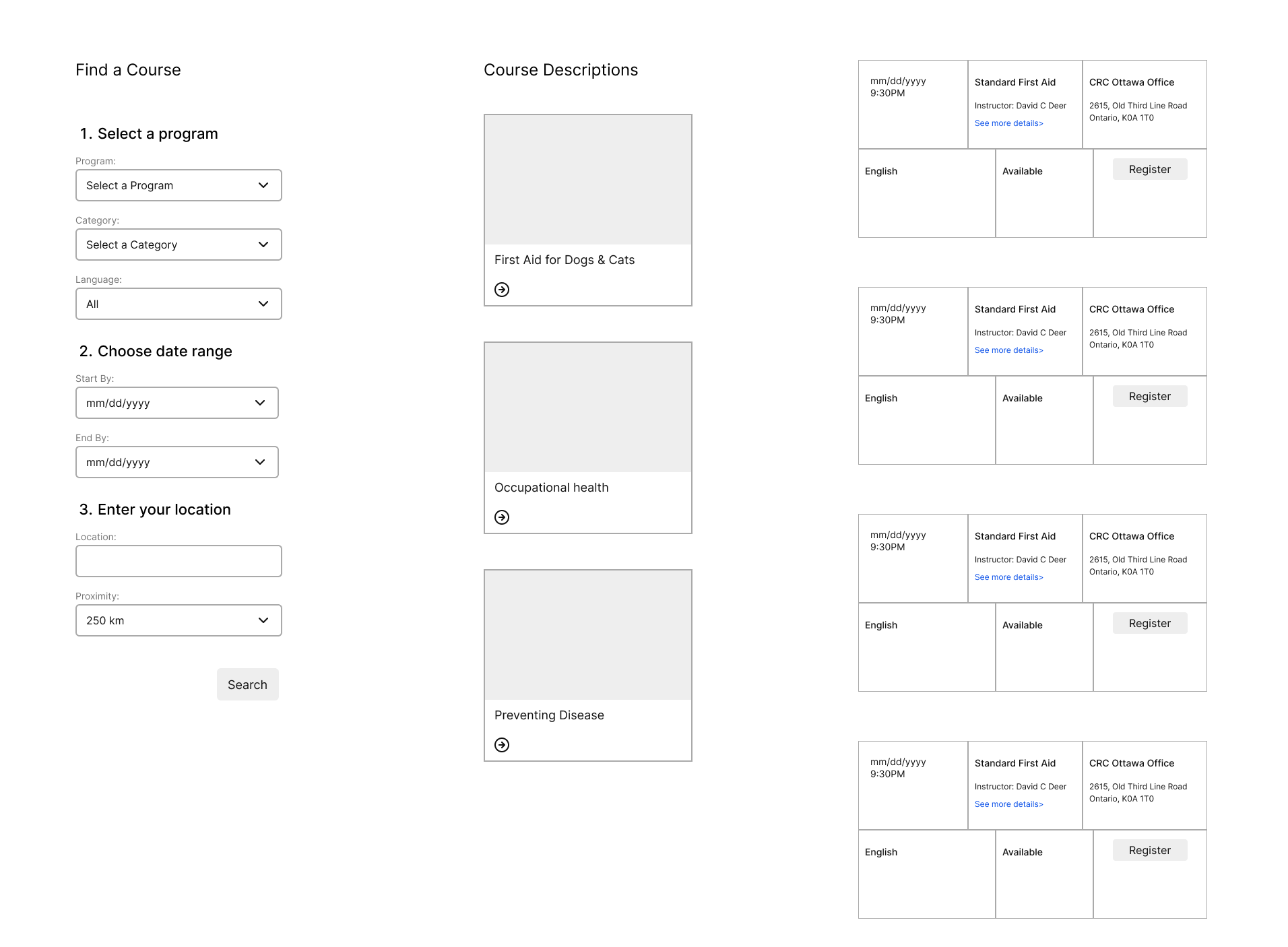
Course Search & Registration
Problem: Public users struggled to find relevant courses due to limited filtering, unclear navigation, and minimal course context.
Solution:
I designed a clean, mobile-responsive interface with:
Filters by location, course type, and delivery method (in-person or online)
Scannable course cards showing key info like title, duration, and certification type
Clear calls to action at every level, including summary and detailed views
Tailored flow for MAS program participants to reduce confusion

Instructor Management
Problem: Instructors relied on manual processes and workaround tools to create course sessions, update participant info, and manage invalid records.
Solution:
I designed an instructor dashboard focused on task clarity and step-by-step workflows:
Easy access to upcoming sessions and rosters
Inline participant editing with field validation
Progress indicators for roster status and submission completeness
Support for exception handling, including manual submissions and invalid entries

UI Components
Once priorities were defined, I led the UX design for high-impact areas, focusing on public course registration and instructor roster management—two of the most common and critical workflows.
Course Search & Registration
Problem: Public users struggled to find relevant courses due to limited filtering, unclear navigation, and minimal course context.
Solution:
I designed a clean, mobile-responsive interface with:
Filters by location, course type, and delivery method (in-person or online)
Scannable course cards showing key info like title, duration, and certification type
Clear calls to action at every level, including summary and detailed views
Tailored flow for MAS program participants to reduce confusion